
PAINT COLORS INSPIRED BY NATURE
DESIGNWELL COLORS FOR AFM SAFECOAT

Michelle Ifversen, Environmental Wellness Designer at DesignWell Studios created a new color line for AFM Safecoat paints inspired by nature infusing biophilic design to boost well being.
Color is a really powerful and an accessible way to bring reminders of nature into our homes. This color line is inspired by my experiences outside to you. These colors are infused with biophilic elements that are known to increase well being.
To order a sample, quart, gallon, 5 gallon of these colors, call or email us and let us know what your project is, square footage and what sheen, pearl, eggshell, flat etc.
We can order any AFM Safecoat Products, DesignWell Studios is the PNW Dealer! (We ship anywhere in the US too!)
We create custom colors! Send me a photo for an inspiration and I will design a custom color for you. I’ll make a paint sample that I can send to the factory and they will create a custom quart for you.
Contact us for samples, pricing or to place your order info@designwellstudios.com or call at 503 386 2003
“Nature is a gift. Being in nature is extremely healing and inspiring. I get a lot of my creative ideas when I hike on beautiful trails whether they are on the coast, in the gorge or in the mountains. ”

FOREST BATHING
Forest Bathing — Roughly translated from Japanese (森林浴 or“Shinrin’yoku”), forest bathing is being in the presence of trees. Forest bathing – or simulations thereof – has been shown to lower heart rate, blood pressure, and stress hormones, and boost the immune system. Eucalyptus, Fir, Wild Mushroom and Spruce and the colors that inspire trips thru the forest. Create a grounded sanctuary in your own space that brings you back to the soothing and supportive strength from the forest.

EUCALYPTUS

This is one of my favorite colors on earth. In college I took a eucalyptus leaf and brought it to the paint store in San Francisco and had them match it. I was inspired by nature to bring it into my environment. I painted my room and instantly felt calm, inspired and happy. Eucalyptus is supremely healing. I drop a few drops of eucalyptus oil in my bath to help open my nasal passage and create a spa-like experience. A couple years ago I was on a trip with my husband riding a motorcycle through a twisty road near Half Moon Bay in California when we came upon a vibrant waft of menthol from the eucalyptus trees as we rode through a huge grove. It instantly gave us a boost of energy! While this paint doesn't smell like eucalyptus (although how cool would that be if it did.…it actually doesn’t smell at all), you can still get the benefits from the color and imagining yourself surrounded by its beauty and smelling its wonderful healing attributes.
FIR

This color reminds me of walking in the forest amongst the giants that grace the earth with their broad presence protecting us and shading us, with roots firmly placed for years on end. This is a color that is grounding, healing, rugged and earthy. It invites us to walk in nature and immerse ourselves in its beauty, strength and healing properties. Place your hands on a strong, tall tree and feel the energy it gives you. Imagine your feet grounded, rooted, safe. If those trees could talk, what would they say? I painted our kitchen wall that surrounds our window looking outside to our backyard above our sink. I chose this to bring in more greenery during the wintertime when all the leaves are gone. It’s warm and cozy. Great for a focal wall too.
SPRUCE

I just love the blue/green/gray hues of evergreen trees. Even though they are prickly by touch, they are soft, alluring and quiet in nature. These are special trees that stand out, creating an awareness of their distinct difference. It’s important to have a variety of colors in the forest, in built environments too for the eye to catch attention and the brain to be challenged. This color is soothing and strong. This color is fantastic for a focal wall. This is the color of a focal wall in my husbands office that frames a window that has natural wood.
WILD MUSHROOM

Mushrooms are a delicacy, a delight and a wonderment and are often one of my favorite subjects to focus up close and photograph. The patterns are incredibly unique and jaw dropping with such intricate designs. They are regenerative, resilient and nurturing to the forest floor. I always stop to admire them as I pass by on the trails. They make a dead log look alive and beautiful. Next time you stumble across wild mushrooms, notice that they look totally different opened and closed. This color was inspired by the underside of a backyard mushroom in the late afternoon. The front was white and tannish gray and the underside a rich warm gray brown. Just don’t eat them unless they are ones you know are safe!

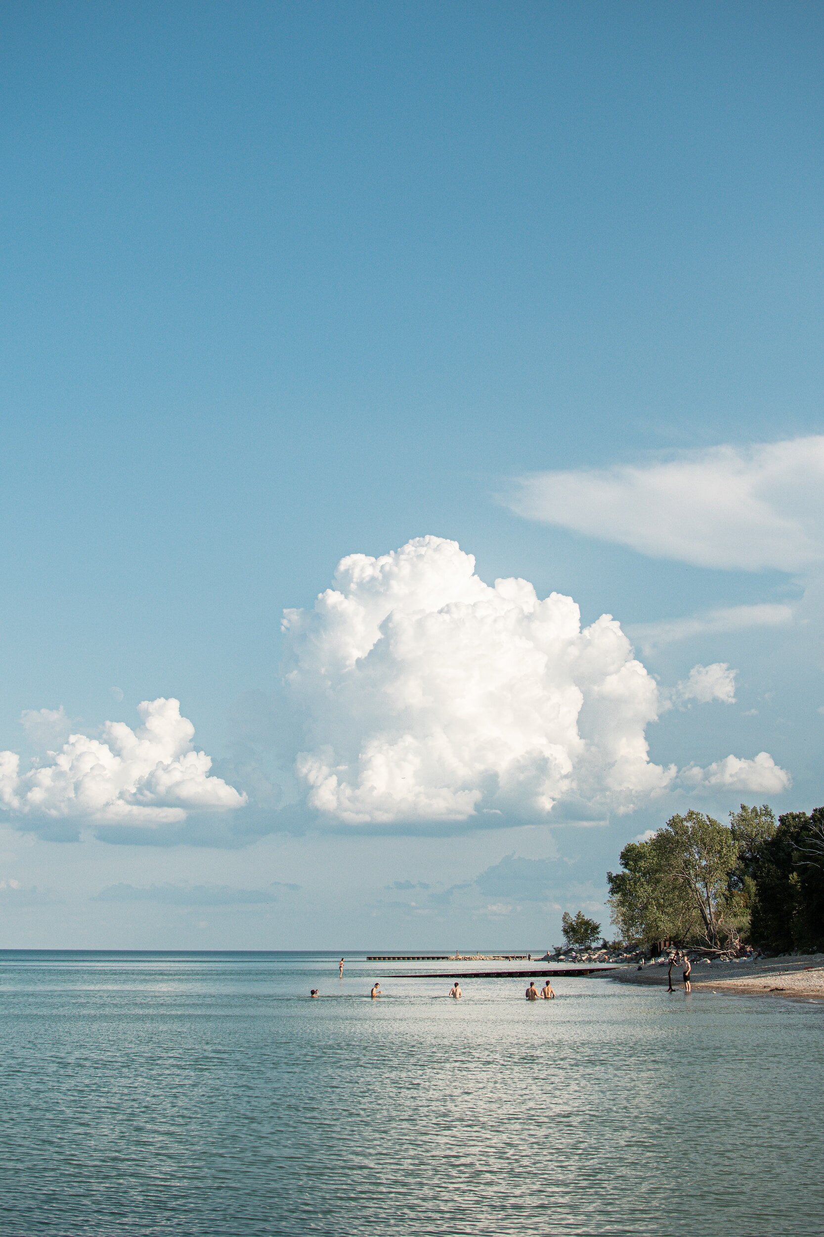
Beach Combing Color Line
Sand Dollar, Sea Grass, Surf and Driftwood are the elements of beach combing line. Transform your space into a calm and peaceful oasis that represents the coastal gifts and cool breezes and warm sun.
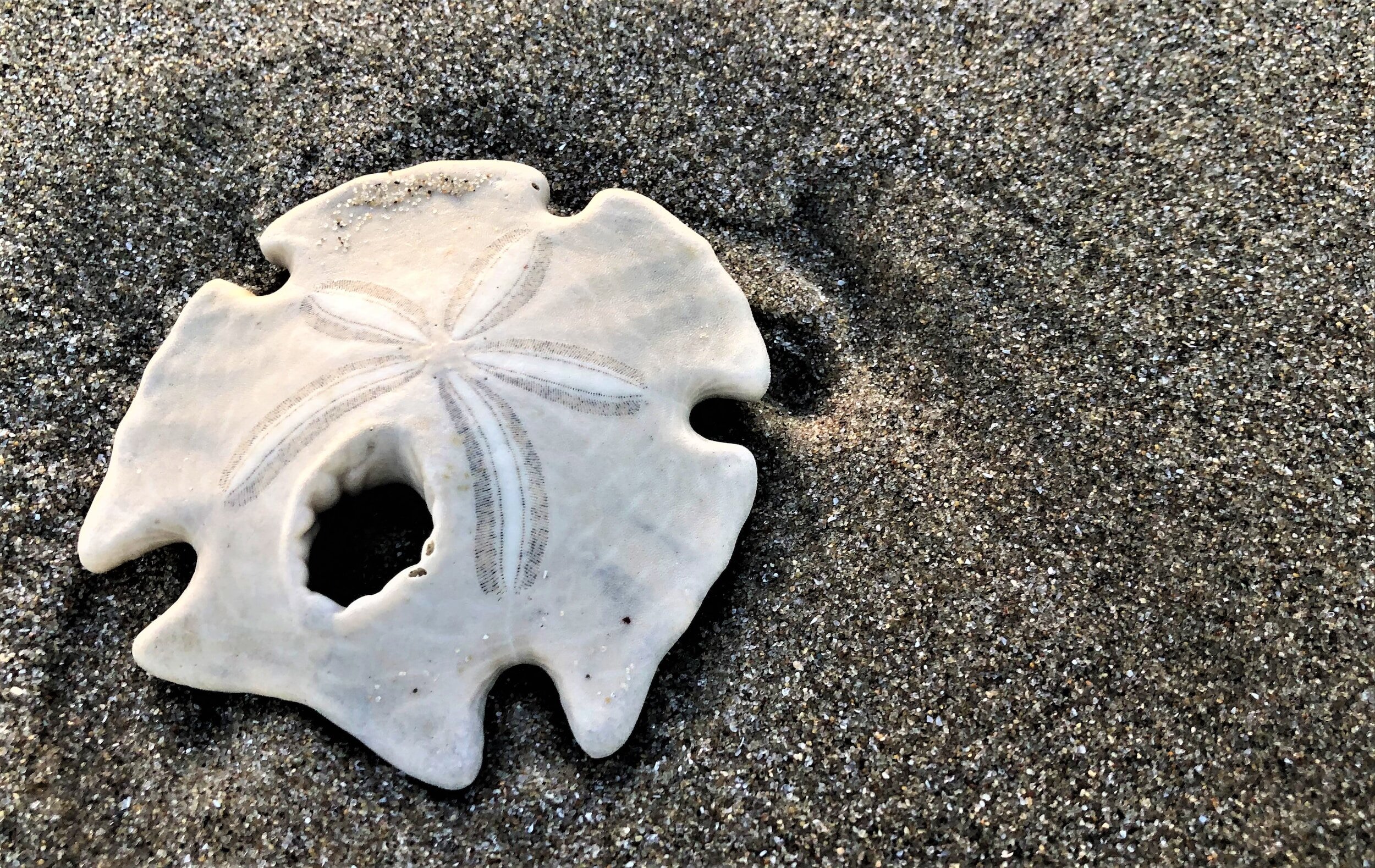
Sand Dollar

I have combed beaches all over the world. It has been a pastime and it’s something I love to do. My whole life, I have never been able to discover a sand dollar in its whole form, until in March 2022!. I was elated, it felt like a gift from the sea. The patterns they show are amazing, so minimal yet profound. The color is soft, varying between light gray to light beige depending on how long they have graced the shore before the birds peck them to pieces.
SEA GRASS

The sea grasses in Manzanita beach blow gracefully in the wind, moving, adding color to the sea scape. They are a haven for wildlife. My boys used to play on the sandy dunes on the coast in Oregon. Beautiful sea grass covered them blowing in the wind making it look like the dunes were alive. They were full of life, a habitat providing nests and shelter for birds and other wildlife. This color is so soothing and evokes a calming nature. Great for nurseries, offices, bedrooms, furniture to name a few inspirational ideas.
SURF

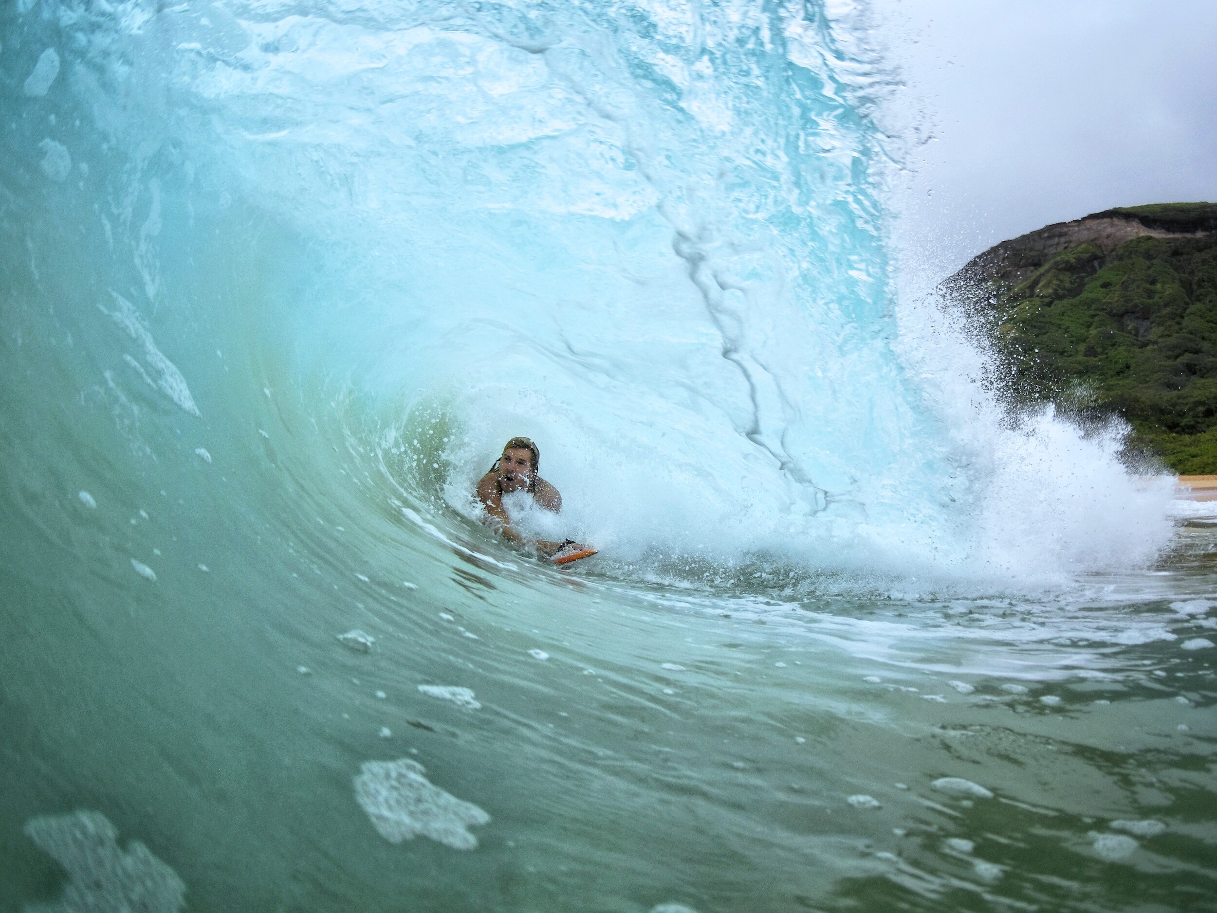
I grew up in Santa Barbara, CA and my husband grew up in Honolulu, HI. We both are drawn to the ocean where the water is warm. This color is inspired by the shallow waters that are warm that reflect the sky in such a beautiful hue. In Hawaii we swam in the water, it felt healing, invigorating and so incredibly relaxing, except for the tandem surfing we did later on a trip together (I am not really a surfer)! Think of this color as a hint of vacation. That perfect escape, even on a gray day in Oregon.

Driftwood

I have always adored beach combing for unique pieces of driftwood. I love the battered, smooth, funky designs that wash up on the shore looking like sculpted art. I have collected a few pieces in my life and have some in our home that we have crafted into towel racks in our bathroom and coat racks in our studios. Having wood around balances and grounds us as humans as we need that connection to nature. This color is a warm hue from the most well traveled pieces of driftwood that I have seen. I hope it inspires you and when you see it you will think of that long walk along the shore and perhaps you’ll find that perfect piece to take home with you.
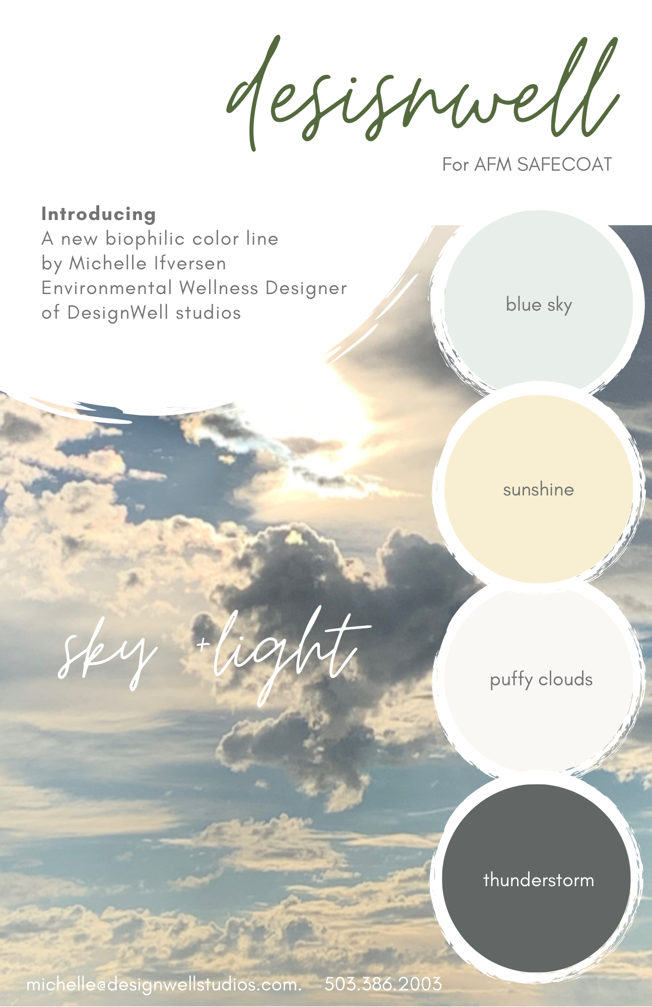
Beach Combing Color Line
The sky is ever changing with the seasons and hours. Look up and cast your eyes on the sky (although not directly at the sun!) and marvel at the magnificent energy and beauty the sky brings. Light up your room with the subtle hint of sunshine to brighten your days or bring in thunderstorm to a bathroom to create a cozy space. These colors cover all the seasons and weather types.
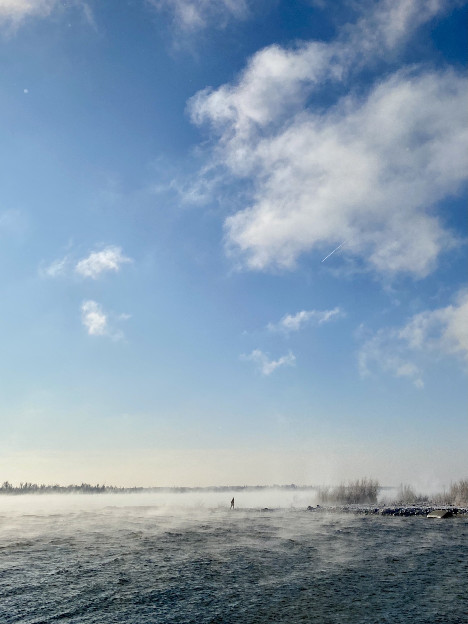
BLUE SKY

Living in Portland, Oregon makes you really appreciate blue skies! This color is subtle and uplifting. When the glimpse of blue sky comes out behind the clouds, my mood instantly changes. It immediately evokes a sense of joy, and the sun shines through making way for beautiful blue skies. It doesn’t matter if the whole sky is blue, it could be an overcast day, cool and windy but finding a bit of blue up in the sky is a gift we all keep chasing. This color is the color in my studio office. It is calming, yet cheerful, bright and inspiring.
SUNSHINE


The sun is a bright beacon and this color represents joy, warmth and positivity. I love it and gravitate towards it (although usually I am wearing a hat and sunscreen). I wanted this color to give you a little warmth, especially if you live in areas that don’t see the sun as often as other areas. Even on cold winter, dark days, this color is sure to boost your mood, provide a ray of hope, and bring you a smile right in the comfort of your space.
PUFFY CLOUDS

Who doesn’t love puffy clouds? I wanted to create a warm white that simulated the essence of flying on an airplane way up in the sky through big, white, beautiful puffy clouds. White is minimal, clean and fresh. I love designs that mimic simplicity, like Scandinavian design with elements of plants, wood furniture, clean lines and organic, fresh textures. When you paint this on your walls, think of being up in the clouds marveling at the earth below. This white I chose has warm tones that are bright and clean. I love it and have it all throughout our home. Great for ceilings, trim and doors too!
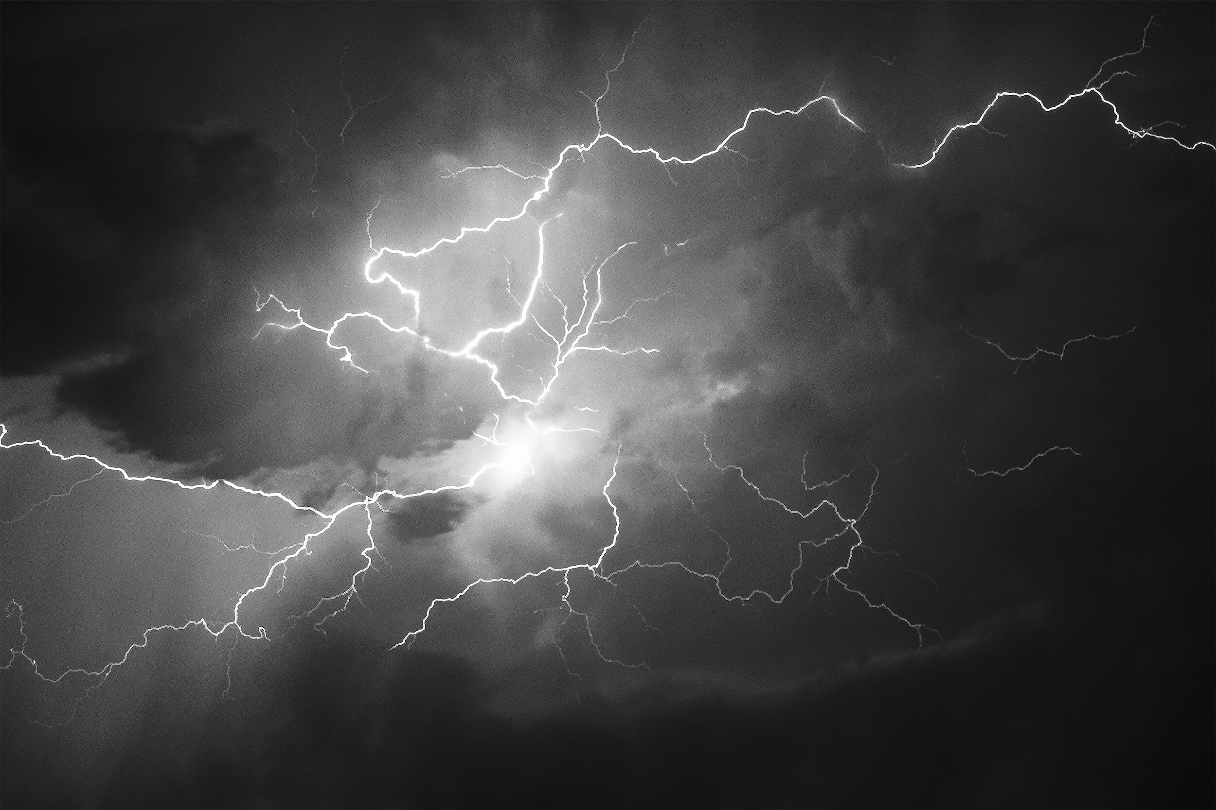
THUNDERSTORM

I admit, I am a storm chaser! I love a good thunderstorm. I have lived in a few areas where I got to witness the big booms and strikes from a far enough distance to be safe, but close enough to feel the energy. Even though this color is a gray hue, it is a warm gray. Think of a summer rainstorm with lightning and thunder in the background and you are warm and dry feeling the energy.

BODIES OF WATER
Water is life. These colors bring in the reminder of our earth is 2/3 water and 1/3 land. There are hundreds of colors that reflect the sky and ground below. Oceans are so powerful yet soothing on calm days. Mountain Streams remind us of camping in the summer hearing the constant trickle. What’s your favorite body of water? Being near water is very good for your well being. Take the time to take a stroll along the river front, ocean shore or lake shore, take a deep breath and notice how you feel.

DEEP LAKE

This rich dark deep blue was inspired by boating on lake Pend Oreille in Idaho. We took a boat out one summer vacation and I noticed the further we rode out the darker the blue the lake got. It was ethereal, mysterious when I peered over the edge. This color is powerful, rich, and has an edge. It’s classic, clean as well as both modern and traditional. It is one of my favorite colors in this color collection. We painted our entire bedroom with this color, even baseboards and back of our door leaving wood acecents from our beams and puffy coulds for our ceiing. It is incredibly tranquil and we sleep amazing. Dark bedrooms are something I recommend for a restful, peaceful sleep. Would you try it? We can send samples, contact us!

OCEAN BLUE

I have always been drawn towards the ocean. It’s like a beacon where I just want to be near it. I grew up near the ocean and have always gravitated towards it, always. Hearing the sounds of the waves, smelling the salt air and marveling at the wild waves that crash on the shore. This color is all about deep respect, profound beauty and wonderment of this incredible body of water. Both my sons love the water, my oldest is near the beach here at his favorite place, mine too! This color great for bathrooms, kids rooms, cabinetry or furniture, anywhere you want to bring in a bit of the ocean vibes inside.

ESTUARY

Water can be murky, dark and riddled with algae and other plant life. It’s a home, a refuge for birds, fish and animals living in harmony and giving life and fuel. It’s an extremely regenerative environment. I have always loved walking along on nearby trails of beautiful estuaries. I hope this color inspires and reminds you of the beauty nature gives and all the life-force that benefits from these wet lands.

MOUNTAIN STREAM

Hiking the mountains is one of my favorite things to do. Especially if the trails or campsites are close to a cool mountain stream. I love hearing the sounds of water trickling over mossy rocks. This color is strong, supportive, subtle and refreshing. It’s the best at cooling down on a hot summer day.
What is Biophilic Design?
Biophilia is the love of nature, and humans' innate connection to it. Most people are disconnected and deprived of nature. The DesignWELL color line infuses elements of nature that are sure to evoke a sense of well being. Biophilic design is all about our human-nature connection and research shows this can be harnessed to improve our wellbeing.
Human dwellings have been studied by Rachel Kaplan (1982), who observed that green is shorthand for nature, despite the fact that not all nature is green. “Greenness” would be equally attractive in the dead of winter when “white” would be a more accurate description. One of the most cited studies in the research literature of healthcare settings is Roger Ulrich’s study of hospital patients recovering from gallbladder surgery. Ulrich (1991) found that individuals had more favorable postoperative courses if windows in their rooms overlooked a small stand of trees rather than a brick building wall. Patients with the natural window view had shorter postoperative hospital stays, had far fewer negative evaluation comments in nurses’ notes (e.g., ‘patient is upset,’ ‘needs much encouragement’), and tended to have lower scores for minor post-surgical complications such as persistent headache or nausea. Further, the wall-view patients needed more doses of strong narcotic pain drugs, whereas the nature-view patients more frequently received weak analgesics such as acetaminophen (cited in Ruga, 1997, p. 221).
"A space with a color palette that feels connected with nature may also be perceived as being a healthy place to dwell, in which one can feel stimulated or calmed. - ”Human Spaces
Biophilic benefits:
Create a more relaxed, calming & restorative home
Reduce stress and anxiety
Encourage positive emotions and mood
Increase productivity, creativity & concentration
Improve recuperation & lower blood pressure
To order a sample or gallon/5 gallon of these colors, call or email us and let us know what your project is, square footage and what sheen, pearl, eggshell, flat etc.
These colors are my inspiration, what is yours? Send in a photo for inspiration and we can create a custom paint or palette for you using AFM Safecoat healthy paints!
Contact us to order info@designwellstudios.com or call at 503 386 2003